Boat Crest App
Designing a scalable brand experience inside a fitness product ecosystem
Timeline
16 weeks
Category
Consumer Product
Service
Brand Design, Visual Direction, Product UI
Goal
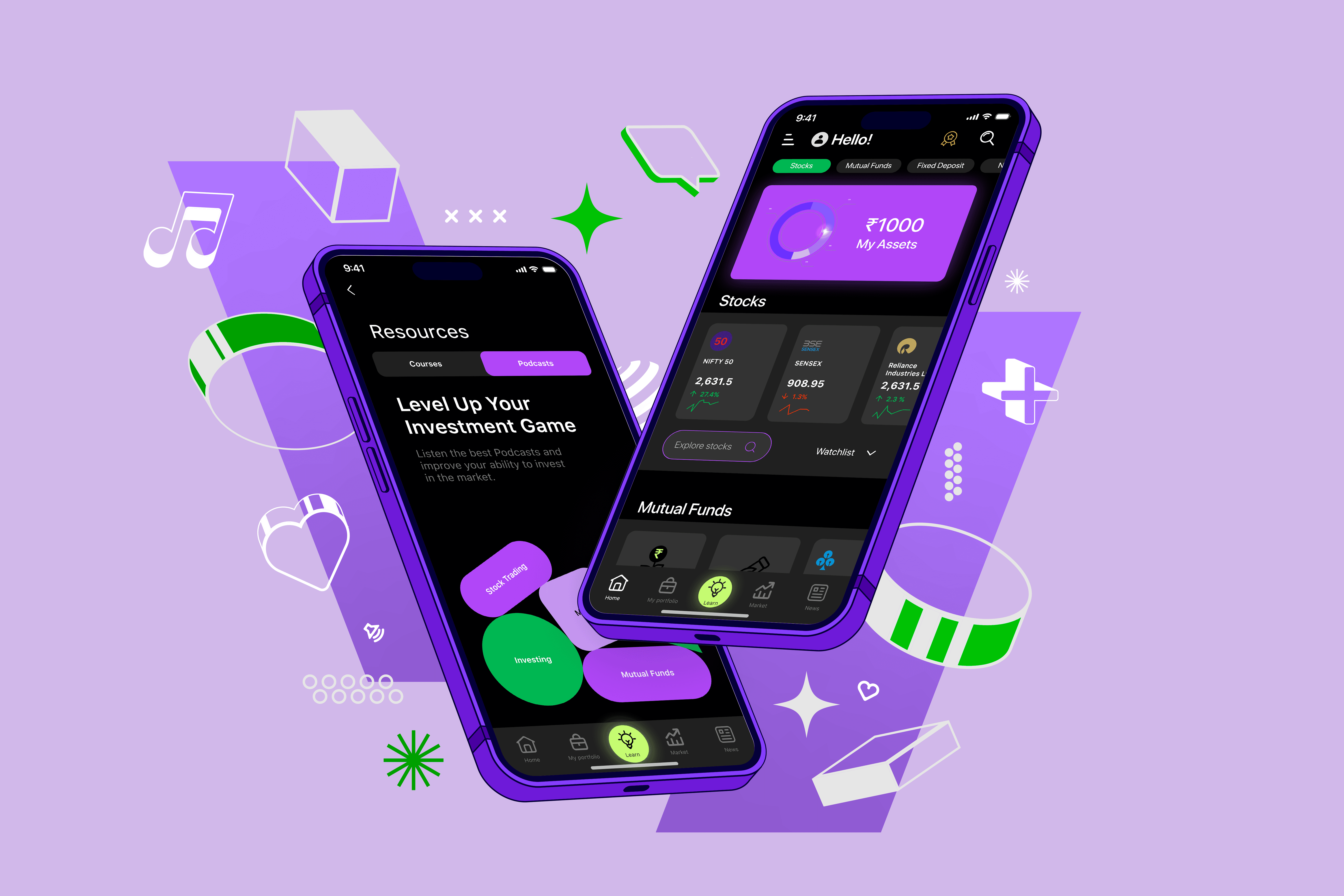
BoAt Crest is a smartwatch companion app designed for daily fitness and health tracking. While the product offered strong functionality, the brand experience within the app felt fragmented. Visual inconsistency, uneven hierarchy, and an emotionally flat interface created a disconnect between BoAt’s energetic, performance-driven identity and how the product actually felt to use. As the app scaled, this gap began to affect perception. The experience no longer reflected the confidence or quality associated with the brand, particularly in moments where users were interacting with personal health data. The challenge was not simply improving usability, but redefining how the brand showed up inside a complex, data-heavy product.

I approached this redesign as a brand system, not a UI refresh. The goal was to embed BoAt’s identity directly into structure, hierarchy, and interaction patterns so the experience would feel intentional and cohesive across features.

The visual language was designed to feel motivating without being loud. A dark-mode-first approach reduced visual fatigue, while typography and spacing carried most of the brand expression. Color and contrast were used sparingly to guide attention rather than decorate screens.

Every decision was made with scale in mind. Components, layouts, and spacing rules were designed so new features could be introduced without fragmenting the experience. Brand consistency lives in the system itself, not in one-off visuals.

This project represents how I approach brand design at scale: translating abstract brand values into systems that shape real, repeated user interactions over time.