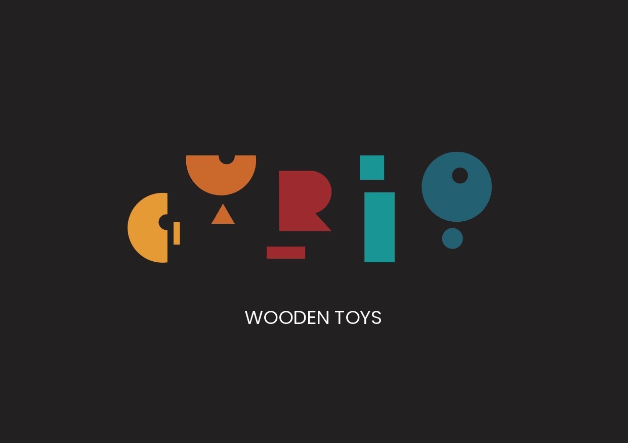
Curio
Designing a visual system for structured exploration and discovery.
Timeline
12 weeks
Category
Product Branding · Cultural Products
Service
Brand Identity · Visual System Design
Goal
Curio was conceived as a brand rooted in curiosity, craftsmanship, and cultural storytelling, inspired by the history and resurgence of traditional wooden toys. The challenge was to create a contemporary brand identity that honored heritage without feeling nostalgic or dated. The system needed to communicate warmth, playfulness, and authenticity while remaining adaptable across modern applications, balancing cultural depth with visual clarity and scalability.

The brand draws from the tactile quality of handmade toys and the idea of discovery through play. Rather than referencing nostalgia directly, the focus was on abstraction—shapes, forms, and colors that suggest curiosity without literal illustration.

Instead of designing a single static mark, I explored a modular logo system. The intent was to create a brand that could shift and adapt while remaining recognizable reflecting curiosity as something dynamic, not fixed.


The final system balances playfulness with structure. Bold forms and unexpected shapes invite exploration, while consistent proportions and spacing ensure cohesion. The identity is expressive, but controlled—designed to evolve without losing clarity.


Curio reinforced my belief that strong brands leave room for interpretation. When structure is consistent, expression can remain flexible without becoming chaotic.