Trove
Creating clarity and orientation within layered information environments.
Timeline
16 weeks
Category
Fintech
Service
Information Architecture · Visual System · Interaction Design
Goal
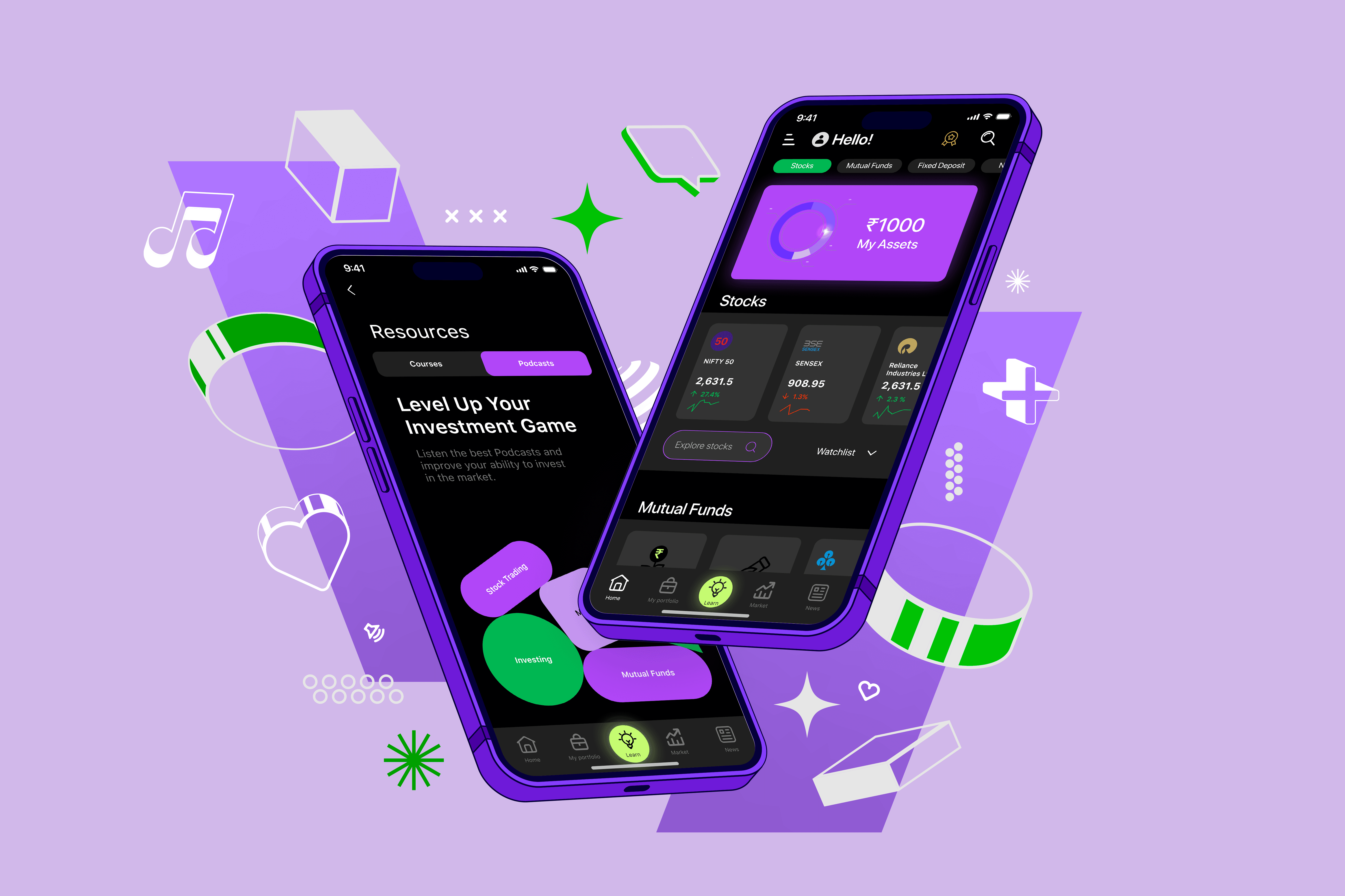
Trove is an automated investment and learning app designed to make investing accessible for first-time and non-professional investors. Most investment platforms overwhelm users with jargon, dense data, and interfaces optimized for experienced traders. Trove reframes investing as a guided, educational experience—one that builds confidence through clarity, structure, and visual calm. The challenge was to design a product and brand system that communicates intelligence without intimidation, and growth without risk-heavy anxiety.

Trove’s brand needed to feel intelligent and trustworthy without appearing exclusive or complex. The visual identity balances confidence and approachability through high-contrast dark surfaces, vibrant accent colors, and rounded forms that soften the experience. Brand attributes were defined early and used as a filter for every product decision, ensuring the interface consistently reinforced learning, growth, and reassurance.

The product interface was designed as an extension of the brand system. Typography establishes hierarchy and readability, while spacing and modular layouts prevent information overload. Data-dense screens are intentionally structured to feel navigable rather than analytical, helping users understand their investments without requiring prior financial knowledge. Brand expression lives in rhythm, contrast, and structure—not decoration.

Education is not secondary in Trove—it is embedded directly into the product experience. Learning modules, progress indicators, and bite-sized explanations help users build confidence alongside financial growth. Visual cues and iconography reduce reliance on jargon, reinforcing Trove’s goal of making investing understandable rather than overwhelming.

Trove was designed as a scalable system, not a collection of screens. Navigation, components, and interaction patterns remain consistent across investing, learning, and market exploration. This ensures the product can grow in complexity without increasing cognitive load, allowing new features to be introduced while preserving clarity and trust.